
Timeslots & Grocery filters
New World Redesign
I reviewed 150 of the world’s leading online supermarkets across Europe, America, Asia, and the Middle East, taking notes on common practices, best UX, premium experiences, and accessibility standards.
Combining this with Foodstuffs’ extensive data on New World user behaviour, I created a prototype that reorganises the layout around the most common user journeys. My goal was to deliver a clutter-free design that makes shopping online at New World feel as premium as visiting the stores themselves.
Hover over the numbers to gain insight into my decisions.
Read insights
The navigation was restructured to reduce clutter and guide the eye from left to right, aligning with the most common user journeys.
Options clicked less than 1% of the time were nested under relevant parent categories.
The mega menu was expanded to include discovery options related to the premium experience of learning and experimenting.
The search bar—New World’s most used component—was given more space to display related search results and recipes connected to the query.
2.
Instead of the typical NW banner floating in a large red space and disrupting the typical users journey, I condensed the ad title and CTA, added white space to guide the eye downward, and prioritised a personal, welcoming touch.
3.
Visual clutter is reduced by placing add/remove controls on hover. Initial concerns about usability were dispelled after user testing showed users intuitively understood and quickly adopted the behaviour.
4.
The previous "Bought-before" design had three separate controls scattered across the corners. I streamlined it by combining all three onto a single line, placing the CTA next to the header and merging bullets and arrows.
5.
One of my core pitches in this redesign was to let users add allergens to their profile and have them excluded from search results. All the necessary data already existed, though oversight is required for serious allergens, such as coeliac, where products processed in facilities containing gluten must also be flagged.
Options clicked less than 1% of the time were nested under relevant parent categories.
The mega menu was expanded to include discovery options related to the premium experience of learning and experimenting.
The search bar—New World’s most used component—was given more space to display related search results and recipes connected to the query.
Open the prototype or view the gallery below.
All the necessary data already existed, though oversight is required for serious allergens, such as coeliac, where products processed in facilities containing gluten must also be flagged.


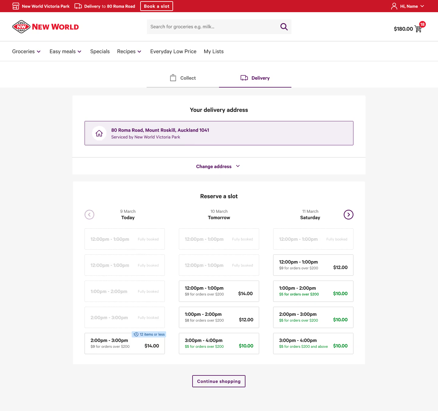
Timeslot Pricing UX/UI
Timeslot pricing was introduced to balance packing demand across stores. It ultimately benefited consumers by offering cheaper pickup and delivery options for those who planned ahead or chose off-peak times.
However, many initially felt penalised, as pricing at this stage was unfamiliar.
My colleague Miguel and I designed a UX flow that clearly communicated the benefit without causing cognitive overload.
After iterative testing—first in-office, then through paid user interviews—we refined the design until achieving over a 90% success rate.
Open the prototypes sidebar to view prototypes for mobile and under/over $200 orders.
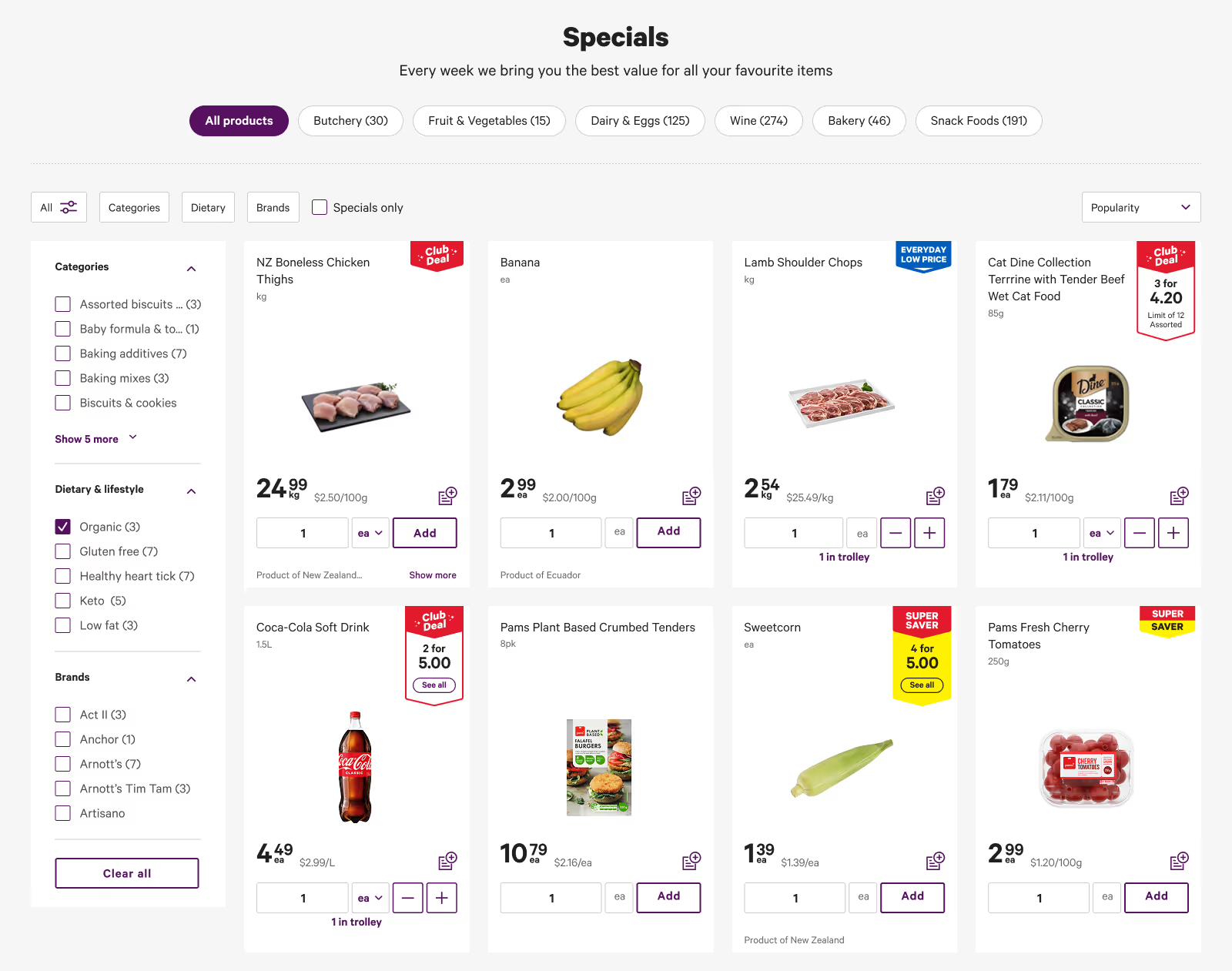
Enhancing Filter Usability
Users reported that product filters lacked clarity and made it difficult to find items.
I created five new variations, each expanding on different ways of expanding the filters for readability and the ability to see all options at once, as well as clearer seperation between labels and filter types.
These are visible in the prototype (activate the side-bar in the top left).
Extensive user interviews showed a consistent preference for the first prototype design.


Interested in seeing more work, learning about my process, or hiring me?
GET IN TOUCH