
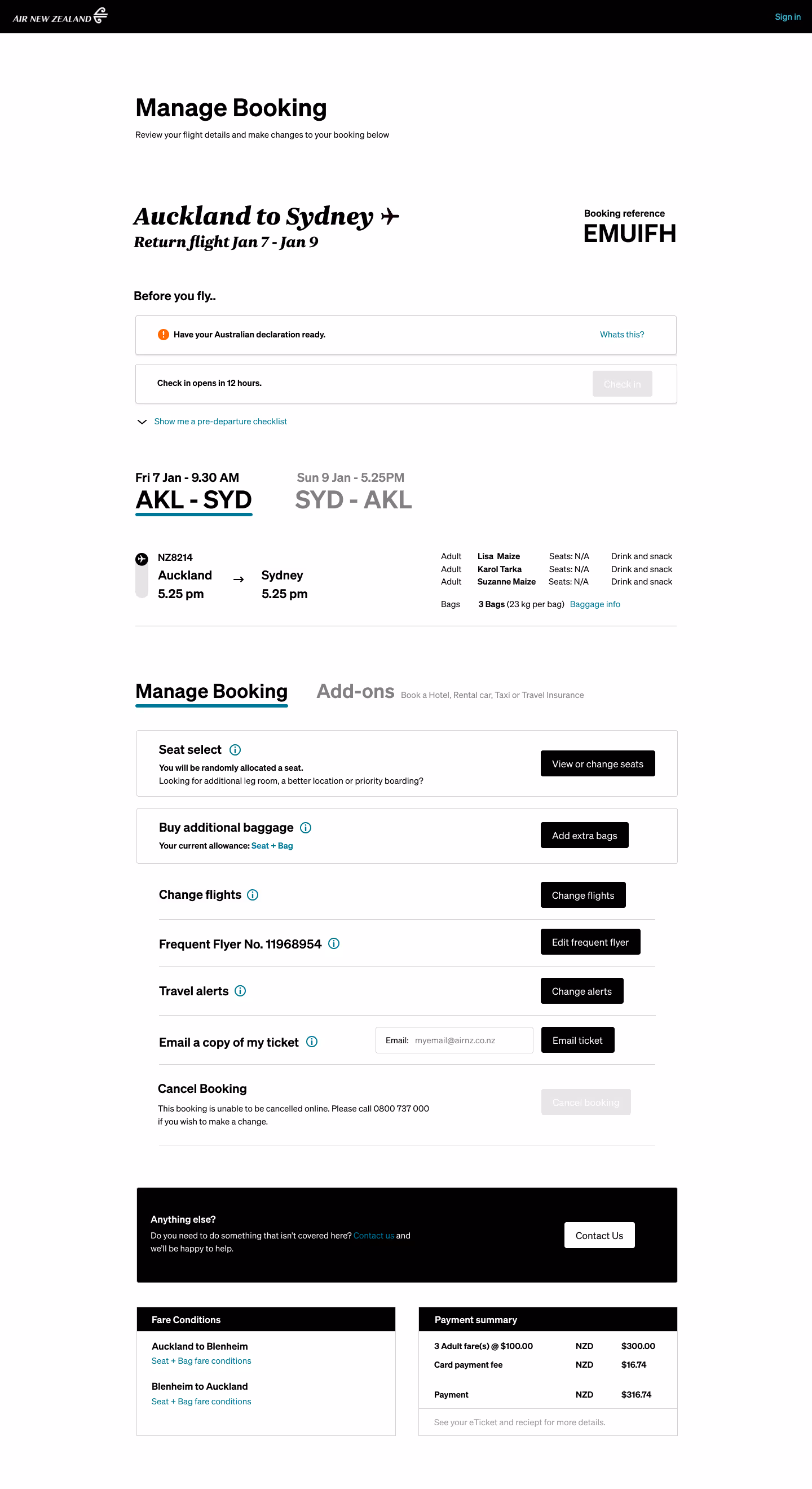
The original UI of “Manage Booking” was a dense array of options and more were slated to be added (see original design below).
Many features saw infrequent use and the helpline was inundated with similar questions about where to find desired options.
One challenge was aligning an experience that prioritises user interests with Air New Zealand’s objective to steer them toward ancillary sales—finding a middle ground that users would accept.
Hover over the numbers to gain insights
Read insights
This was the final UX prototype. To see the initial design, and 2 intermediary stages, check the gallery below.
2.
The helpline was inundated with COVID-related calls in 2021. I created this section to prioritise the most important pre-flight checks.
3.
The original manage booking design (see below) took up a great deal of vertical space, and looking at the scroll data in analytics, very few people made it past 25%Hiding less relevant information inside of tabs was tested to have the best outcomes.
4.
Users felt overwhelmed by options in the original design. I separated CTAs relevant to the upcoming flight from optional add-ons. To align with Air New Zealand’s goal of promoting ancillary sales, I prominently featured “Seat Select” and “Buy Additional Baggage” with imagery in the final UI design (below).These were directly flight-related and the most purchased extras. This created a natural middle ground between user expectations and Air NZ’s commercial strategy.
Hiding less relevant information inside of tabs was tested to have the best outcomes.
To align with Air New Zealand’s goal of promoting ancillary sales, I prominently featured “Seat Select” and “Buy Additional Baggage” with imagery in the final UI design (below).
These were directly flight-related and the most purchased extras. This created a natural middle ground between user expectations and Air NZ’s commercial strategy.
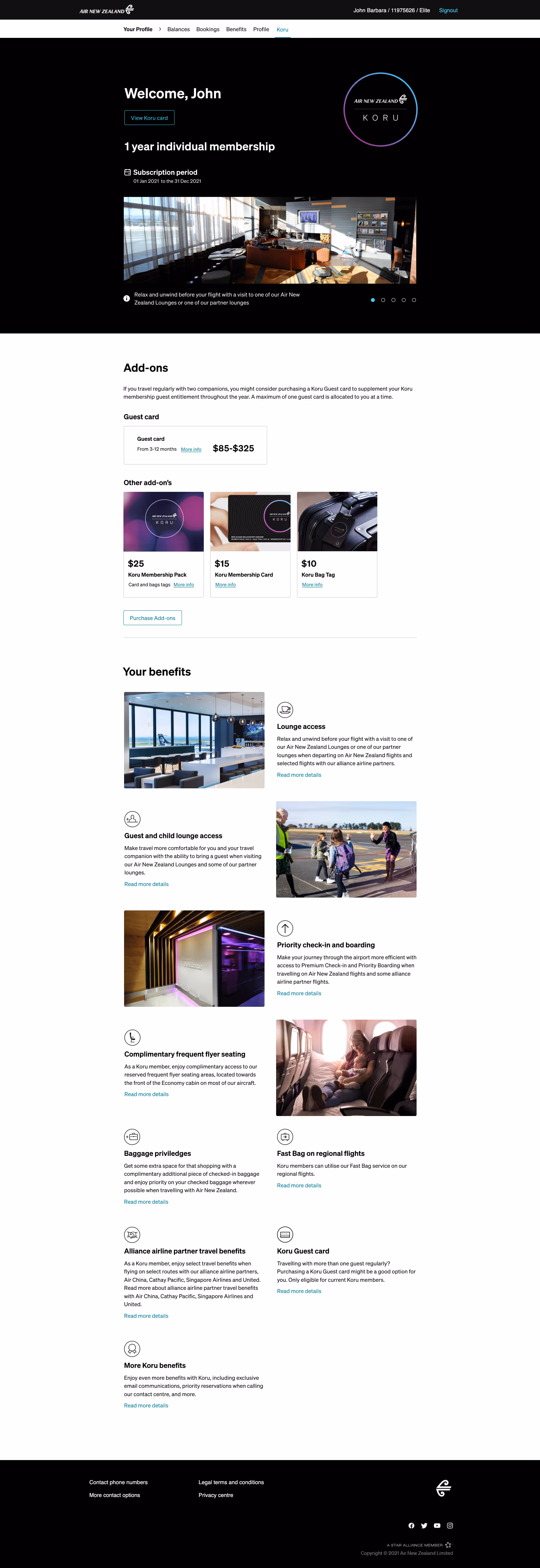
Post UX, I was asked to find a way to inject excitement and anticipation into viewing an upcoming trip. There was considerable scope for innovation, which led me to designing this sleek black hero that departs from the standard AirNZ online experience.
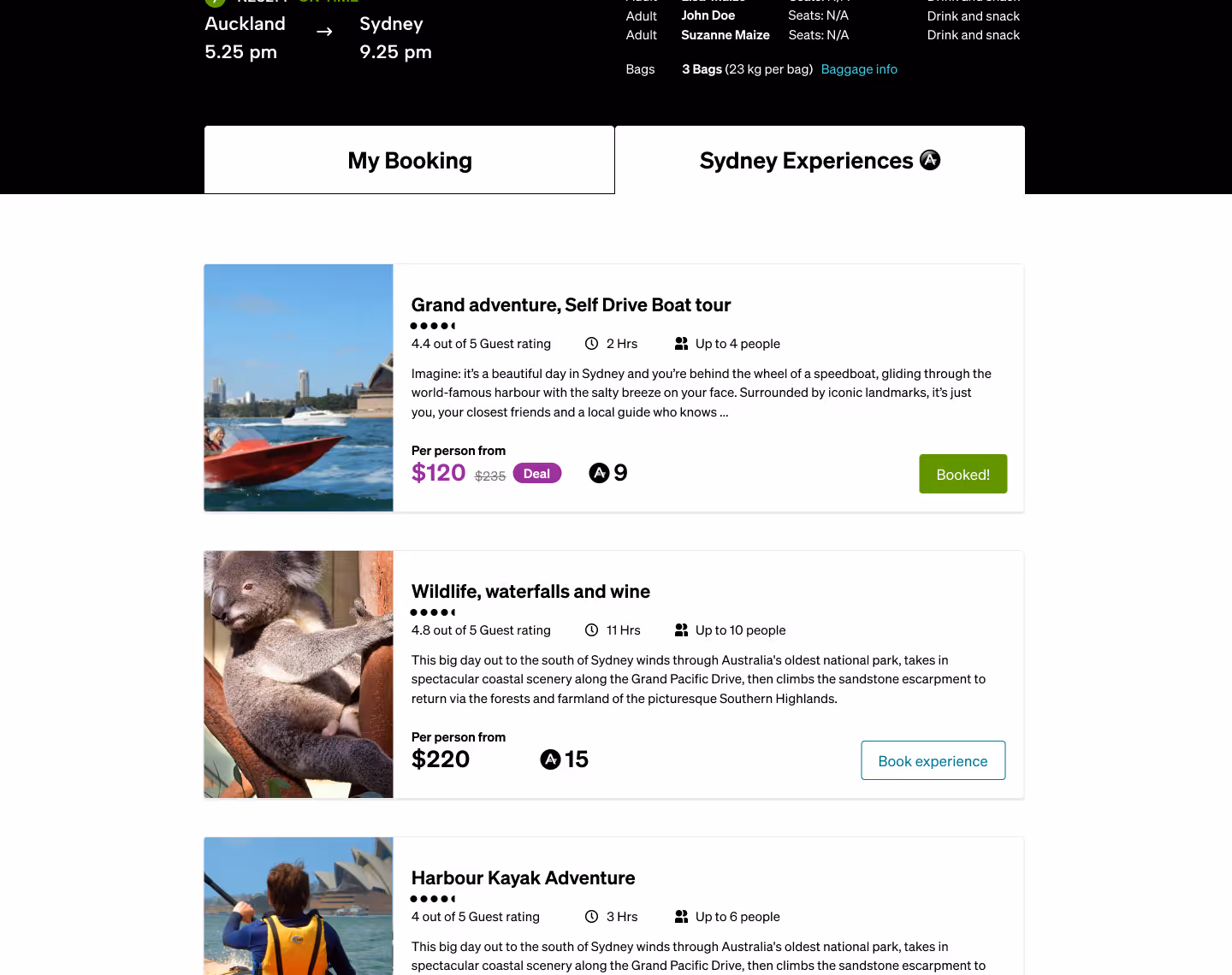
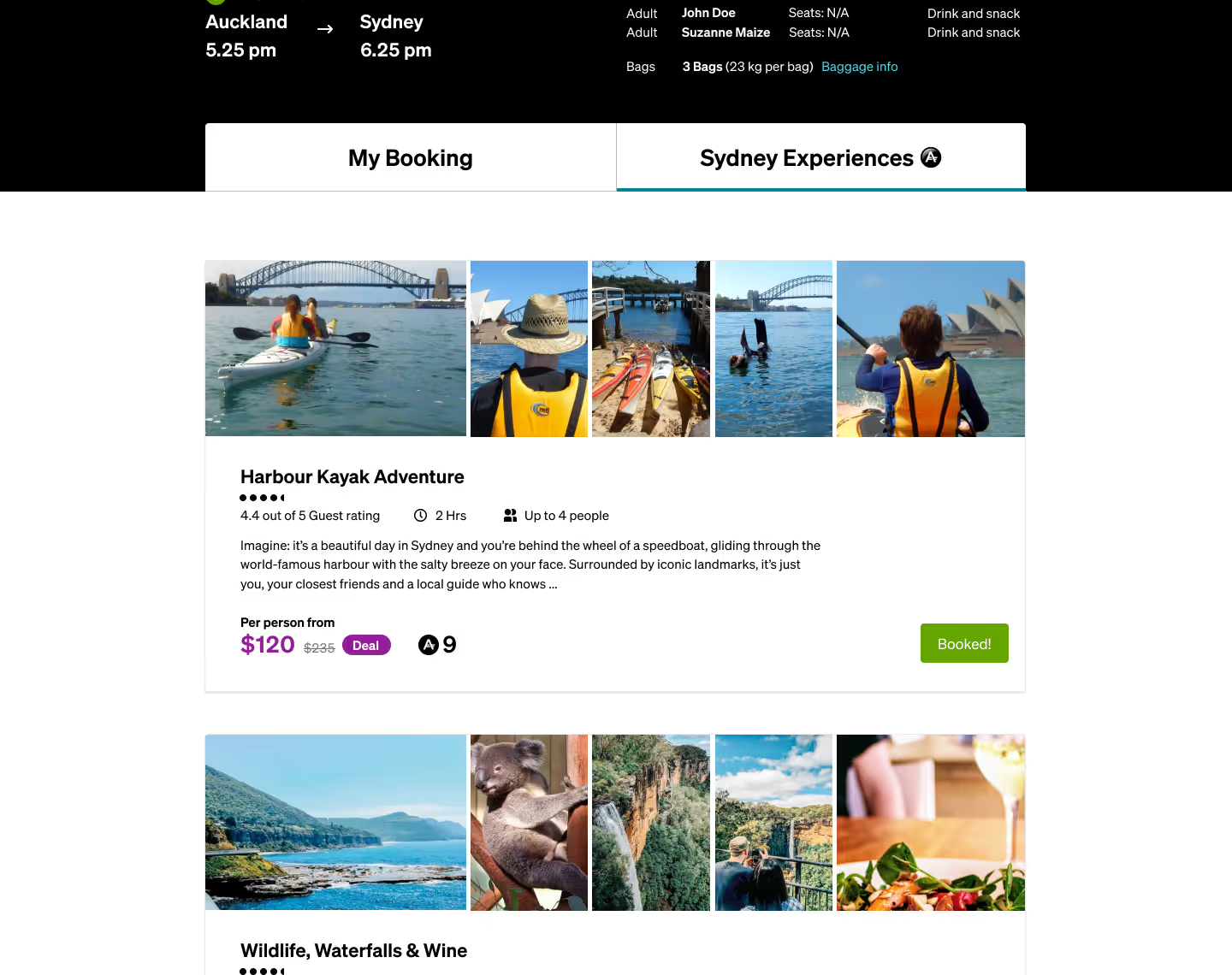
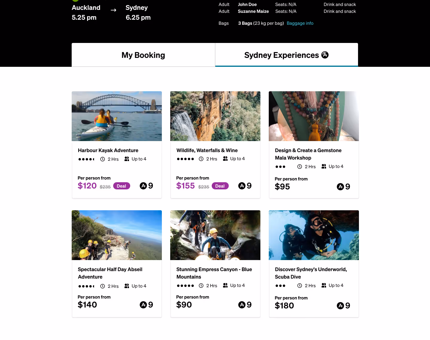
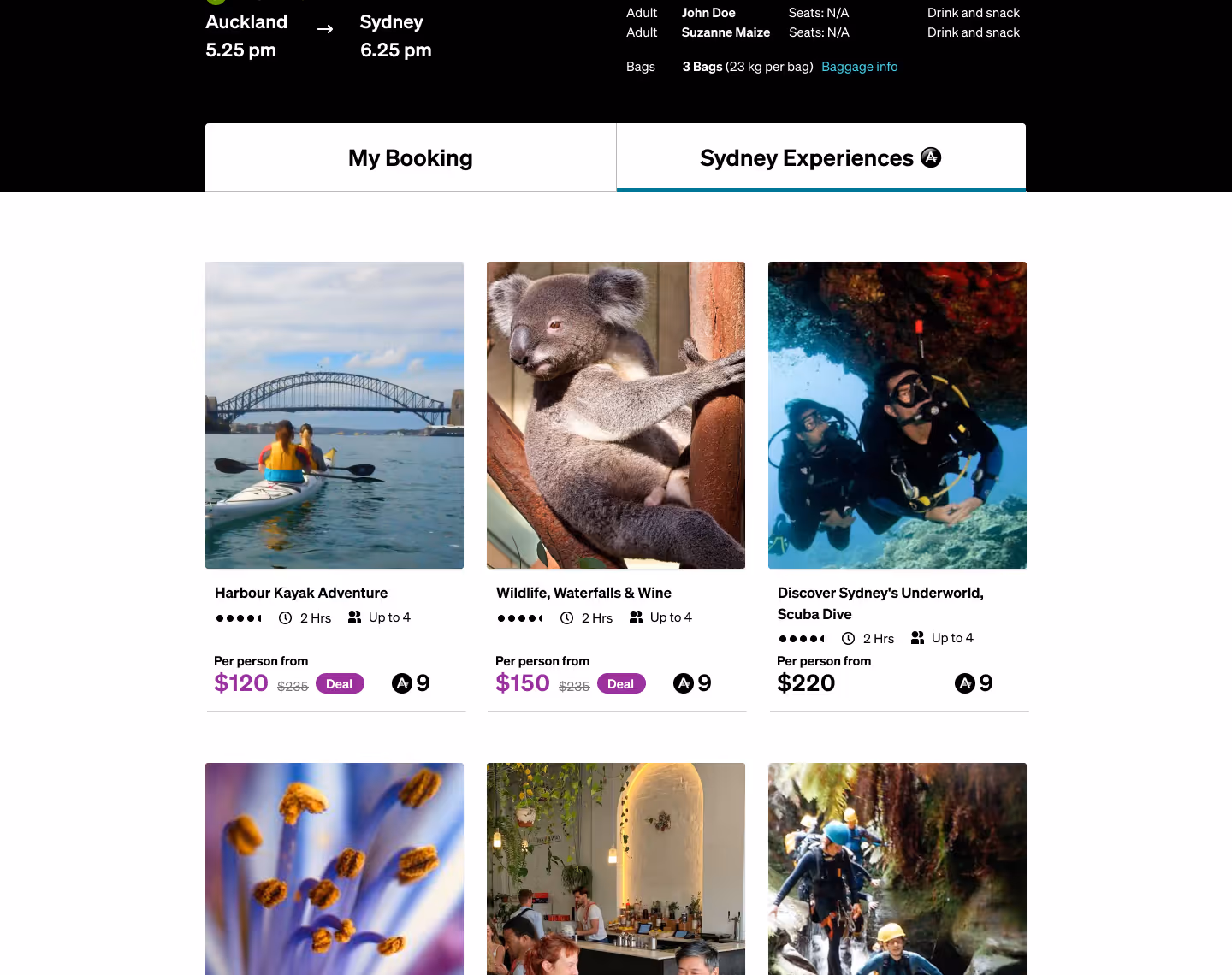
There was talk of offering air-bnb style experiences in future, so I prototyped the ability to book experiences (similar to Airbnb) directly via the portal (see designs in the gallery below).
One final UX amend during the UI phase was to visually separate the least‑used “Manage Booking” options from the frequently sought ones. For example, you can see this distinction between “Change in‑flight options” and “Frequent flyer no”.

.avif)
Like the famed private lounge, the Koru Gateway had to convey the same luxury appeal — a section of the Air New Zealand website that felt a tier above the rest.
Air NZ has a strict style‑guide, thus I needed to learn its rules then find pockets in-between requirements where I could innovate fresh layouts.
View the mobile design


Interested in seeing more work, learning about my process, or hiring me?
GET IN TOUCH