Amp Insurance
I was contractually hired by ISOBAR to re-design the AMP website interface, with the goal of bringing its outdated interface into the modern-day expectations of usability and design. The re-design also included user testing with Figma prototypes.
The redesign was finalized and signed off within a three-week timeline.
The redesign was finalized and signed off within a three-week timeline.
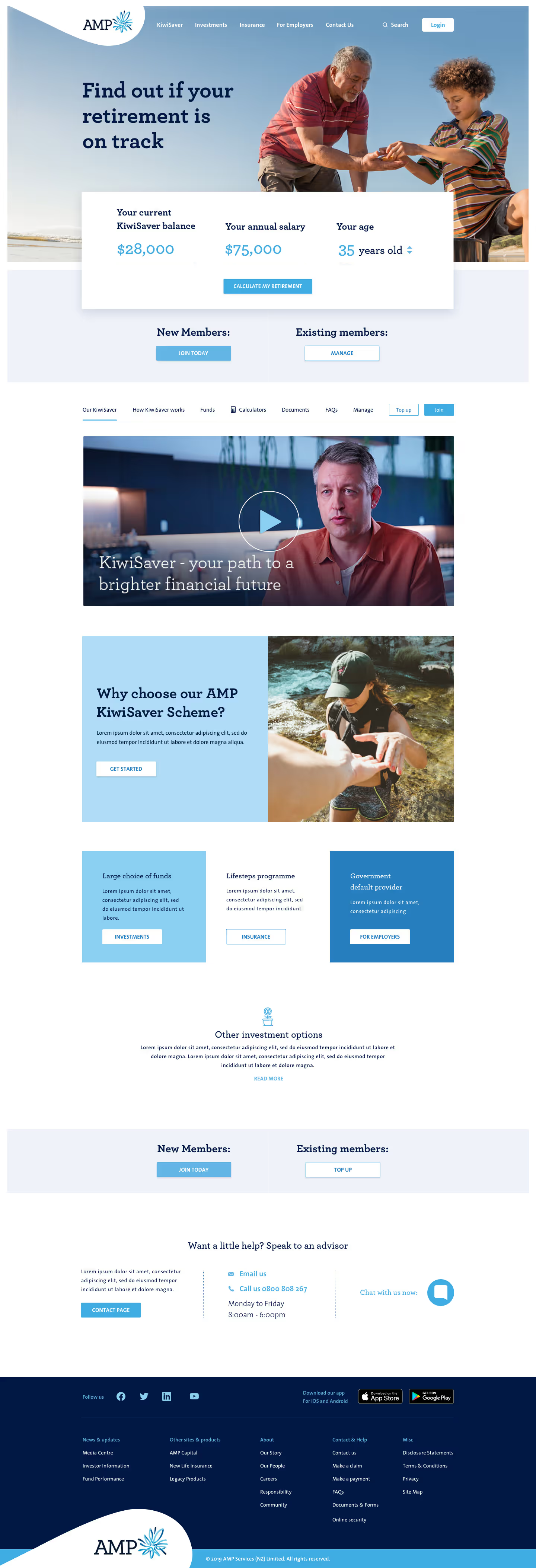
HOMEPAGE
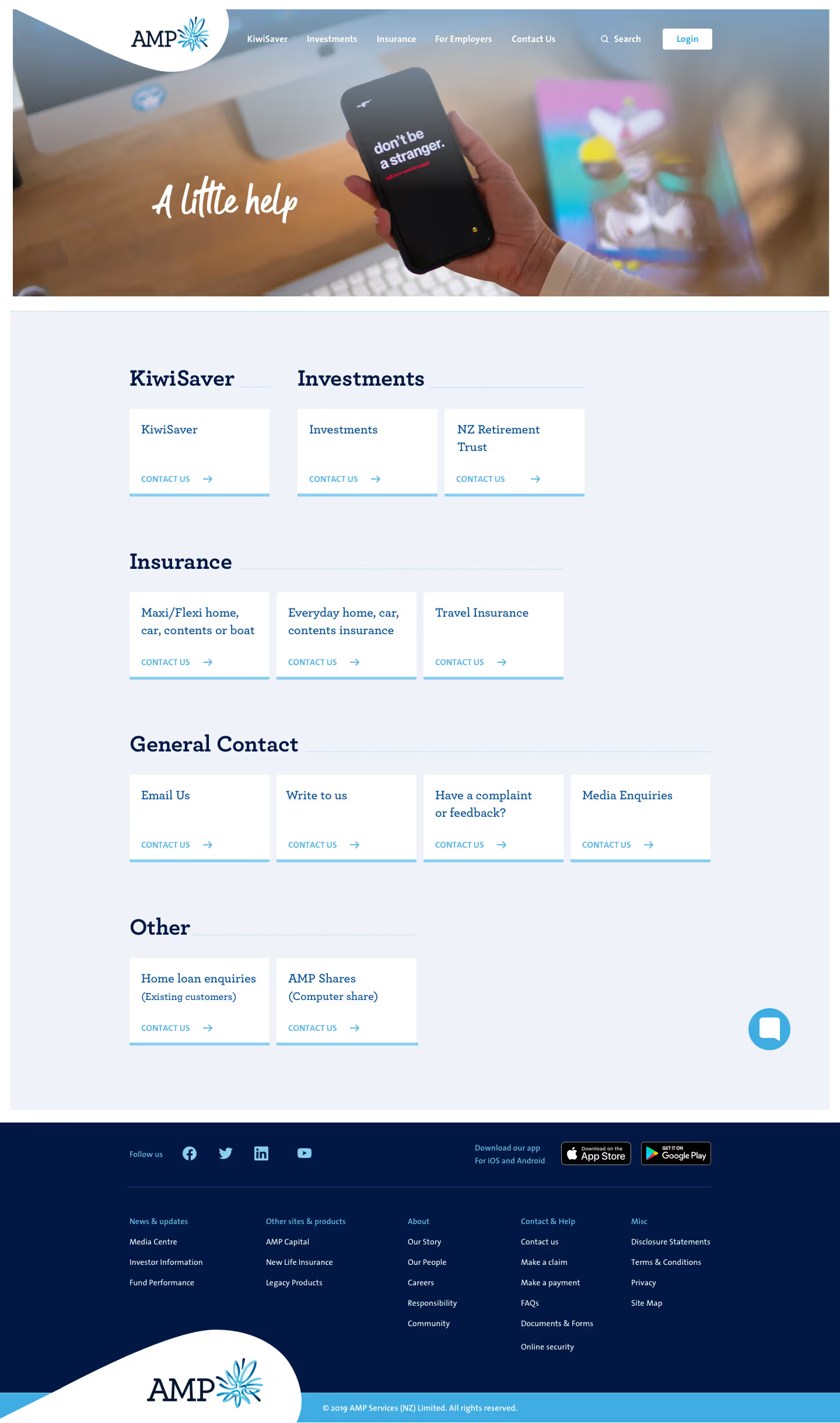
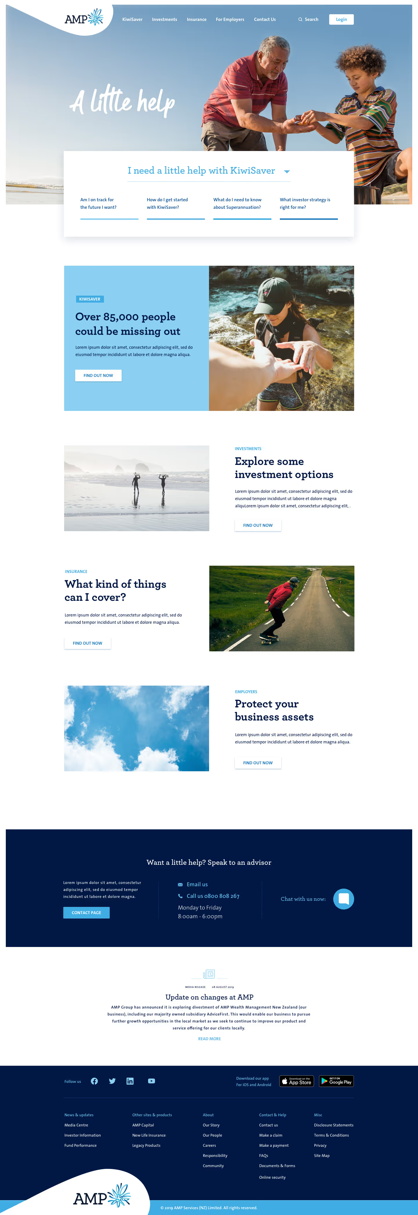
AMP had just done a rebrand in their print department and desired to carry it across to the web. Their new identity orbited around the ethos of 'A little help'.
After some intial UX and wireframing, this was the design signed off by AMP.
Hover over the numbers to gain insight into design choices.
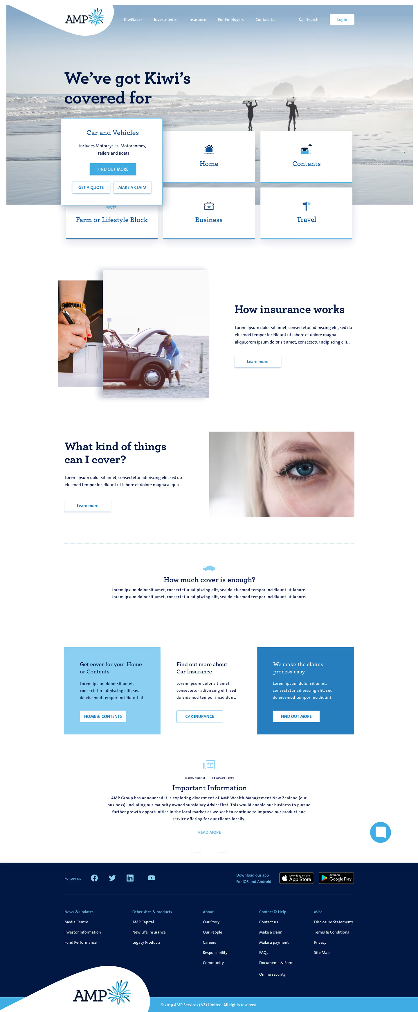
I opted for a bordered layout that incorporated the new slanted pillbox design and developed a style guide centred around their photography.
They had an excellent photoshoot that produced imagery with clean, natural gradients and softly blurred backgrounds—providing visual breathing room that I intentionally highlighted throughout the design.
In a later version of the website, this approach was replaced due to the challenge of consistently sourcing photos with minimal, uncluttered backgrounds.
The brief was to emphasise the tagline “A little help” by surfacing the most frequently asked product questions—the main source of customer service friction—in a compact, unobtrusive component that supports the user journey without interrupting it for those who choose not to engage.
1
2
FUND FINDER
A three-step page designed to help users identify the fund that best suits their needs. Drawing on examples from leading insurance companies worldwide, I focused on creating a clear, intuitive experience that remains accessible—even for older users who are less familiar with technology.

GALLERY
OTHER PROJECTS
Interested in seeing more work, learning about my process, or hiring me?
GET IN TOUCH


